Vanguard
Financial Dashboard
Role:
Product Lead
Company:
Partnership with Vanguard UXR
Tools:
Figma, Adobe, Kardsort.com
OVERVIEW
Improving onboarding clarity and decision confidence for emerging investors through usability research and product iteration.
Vanguard’s Digital Advisor targeted emerging investors, but initial usability testing revealed consistent friction across core onboarding and portfolio-management workflows.
Over four months, I led iterative research and redesign efforts focused on improving comprehension, navigation, and decision confidence for less-experienced users. The redesigned prototype improved completion rates across the platform’s highest-friction workflows from 50% to 100% in follow-up usability testing.

PROBLEM
Initial usability testing revealed friction across three core workflows: configuring investment risk, setting financial goals, and locating tax-related information.
Participants were often able to find the relevant areas of the product but hesitated when interpreting financial terminology or understanding the implications of their choices. This hesitation created uncertainty during key onboarding and portfolio setup flows.
The pattern suggested a broader issue around confidence rather than navigation alone, particularly for users with limited investing experience.
KEY INSIGHT
The platform assumed a level of financial literacy and investing confidence many target users did not yet have.
The misalignment in user mental models in comparison to the existing product created a major gap: I focused on reducing cognitive friction while preserving the financial terminology and accuracy required in an investment context.
RESEARCH
I conducted two rounds of moderated usability testing, user interviews, and card-sorting exercises with university students and early-career professionals across varying levels of investing experience.
Research focused on:
task completion behavior
hesitation points during decision-making
navigation expectations
confidence when interpreting financial information
Findings were consistent across participants, particularly in workflows involving risk and tax-related decisions.

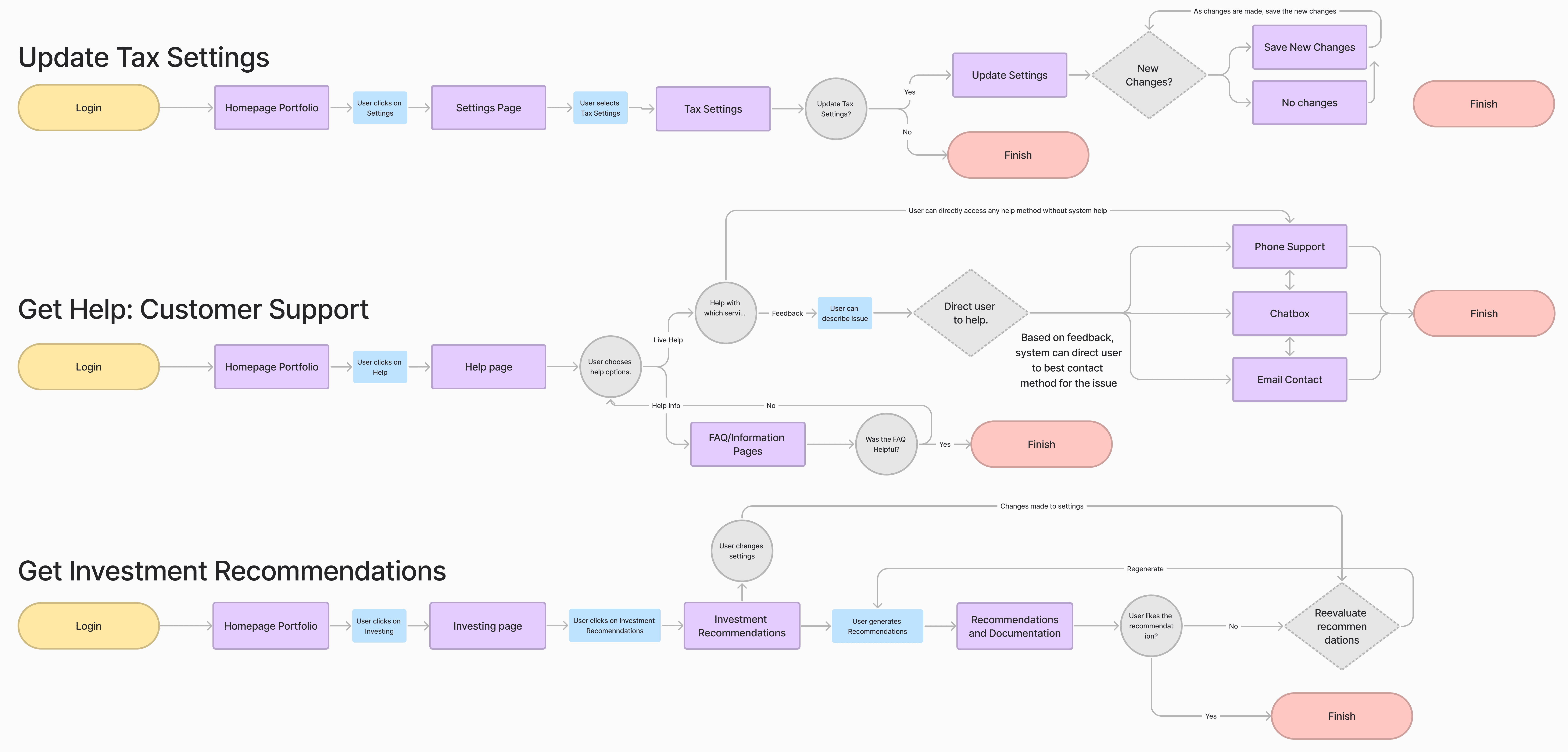
NAVIGATION
Card-sorting exercises showed that participants expected product features to be organized around personal financial goals rather than internal product structure.
I reorganized navigation around user workflows, consolidated portfolio information into a unified dashboard, and adjusted labels to better reflect language used by participants during interviews.

LANGUAGE
Participants often struggled with abstract risk terminology and uncertainty around consequences.
I reframed risk selection around practical outcomes and long-term tradeoffs while retaining established financial terminology. The goal was to improve interpretability without reducing financial accuracy.
This extended to key tasks and navigation, with 4/6 users expressed doubt and frustration in testing.

PILOTING FEATURES
Beyond usability improvements, I explored additional concepts aimed at increasing confidence and long-term engagement for emerging investors, with special focus on migrating users to other Vanguard products which involved additional knowledge of investing.
RECOMMENDATIONS
Participants frequently expressed hesitation when making investment decisions due to fear of making irreversible mistakes.
To address this, I designed a low-risk recommendations sandbox that allowed users to explore hypothetical investment scenarios and see guided suggestions before making real portfolio changes. The concept focused on reducing decision anxiety through safe exploration rather than automation.
EDUCATION
Across testing sessions, participants often lacked foundational understanding of key investing concepts.
I piloted contextual educational tool tips and modules embedded within relevant workflows. Rather than separating learning into standalone help content, the goal was to support understanding at the moment of decision-making as well as guide further engagement with the Vanguard ecosystem.
CONSTRAINTS
Several design decisions required balancing usability improvements with platform realism and project constraints.
I chose not to fully redesign goal-planning flows because participants generally completed those tasks successfully during testing. Instead, I concentrated on workflows that combined high failure rates with low confidence.
Visualizations produced mixed feedback. Some participants found them helpful for understanding portfolio structure, while others found them overwhelming. Rather than removing them, I simplified supporting explanations and focused on improving contextual clarity.
The project was also constrained by a small participant pool, limited access to internal analytics and design systems, and a fixed timeline. These limitations influenced both the scope and depth of validation.
VALIDATION
A second round of moderated usability testing was conducted using the redesigned prototype to evaluate whether the updated flows improved comprehension and reduced friction.
Risk configuration and tax-related workflows improved from 50% to 100% task completion in follow-up testing. Participants also completed navigation tasks more efficiently and demonstrated higher confidence when interpreting investment decisions.
Given the small and directional nature of the sample, results were used to guide iterative design decisions rather than establish statistical significance.
The final prototype and recommendations were presented to Vanguard’s UXR team for feedback and discussion.
REFLECTION
Usability challenges in financial products are often rooted in uncertainty rather than interface complexity alone, which presents a huge barrier to customers, not to mention new investors!
Participants frequently hesitated not because they were unable to navigate the product, but because they were unsure about the implications of their decisions. This shifted the focus of the redesign toward improving interpretability and confidence while maintaining financial accuracy and trust.
If I continued the project, I would expand testing across a broader range of investing experience levels and evaluate downstream outcomes such as onboarding completion, support usage, and feature adoption over time.